Canvaswork
Click on the images to enlarge them!
May 2020 - February 2021
The Forest Tower
What on earth came over me to design my own picture as my "Canvas Sampler"? A big picture! I must have been mad. Even more so after working through only one exercise in canvaswork and without any experience in shading. But I had a vision and I wanted to realise it. See for yourself if it was worth it.
The Endless Designing Process
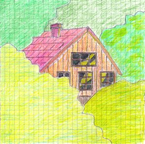
It all started from this sketch:
A house. A simple house. A simple house in a simple forest.
I wanted to embroider architecture after all, and I wanted to do canvaswork. But I also wanted to keep it simple.
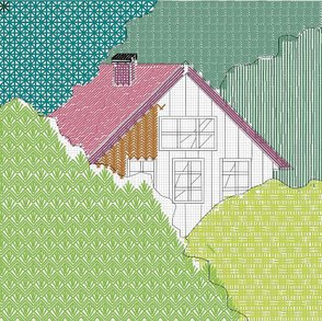
So I loaded the sketch into Inkscape and started off with a preliminary drawing. However, as I had no experience at all in using the various canvaswork stitches, I came up with an "ingenious" idea: I picked out several stitches from Rachel Doyle's Essential Stitch Guide to Canvaswork that I thought would suit, and inserted each single stitch into the drawing in Inkscape as I went along.
"Stichprobe" 😅 (for those unfamiliar with German: Stich = stitch, Probe = sample, test. Stichprobe = sample, but not related to needlework,)
One month later - the filling in was almost finished and I was endlessly playing around with the colour scheme, to no avail - I didn't like the house any more. I realised that I wanted something more mysterious and I set off in search of inspiration.
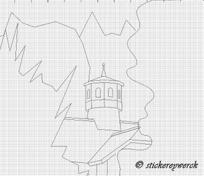
What I brought home from my hunt was a tower. A tower in the woods.
Tower in the Woods - Vector Drawing
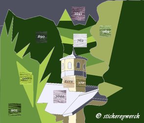
What I did first this time was to lay out all the colours. This is best done in Gimp. The idea was to use a mix of Green and Purple only, with light and shadow, because this is my favourite colour combination.
As you can see, I sought out the appropriate thread numbers too. It was DMC stranded cotton. I had to match the colours of crewel wool later, because it was crewel wool I wanted to stitch most of the picture with. That would turn out to be quite a problem.
Tower in the Woods - Colour Scheme
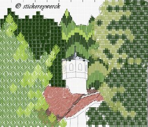
And off I went again, searching for matching stitches and inserting each single one into the drawing.
Tower in the Woods - Stitch Scheme
After full two months of tinkering about with shifting little sticks and groups of little sticks I had enough. It was as good as it gets. I ordered a decent piece of a 17 ct. yellow canvas, as I read somewhere that in most projects it is better to use off-white or coloured canvas, so that the white doesn't shine through. Plus I ordered a little stash of crewel wool in Greens, Purples and Off-Whites.
I set to work on August 1, having calculated width and height, and I started with the sky in tent stitch with 3 strands of stranded cotton.
The Beginning of a Huge Project
Problems Encountered
- It was then when I noticed that I had a problem, and not a minor one. Enumerating the stitches in the design I saw that the whole work would be ca. 50 x 40 cm (20" x 16") big. Far too big for my largest ring frame, and I still don't have a slate frame. Since you can't move a canvaswork piece around in a hoop, there was nothing else for it but to stitch the thing in hand. In case of a "normal" fabric, say linen or cotton, it wouldn't have been a big problem. You wrinkle it up - you iron it. Dampen it, if need be. But not with canvas! Canvas is stiffened or sized and with good reason. If you wet it, it gets flabby - see my experience here. So ironing doesn't help against wrinkles.
- What's more, I had ordered the canvas folded, although the shop owner had asked me beforehand, if I would like to have it rolled up. It hadn't even occurred to me that the folds could not be removed.
- To top it all, as I noticed later on, the canvas did not only wrinkle up like mad as the stitching went on, but the fabric was increasingly softened by holding it in my hands. Palms get always sweaty when you hold something in them over a longer period of time. But I kept going. What else could I do? I could only hope that the finished work would somehow get blocked.
- Canvaswork is a counted embroidery. So I had marked every ten threads of the canvas both horizontally and vertically. I found out quickly though that this was not nearly enough to place the elements correctly. You go nuts if you begin to count the threads every time in every direction in such a huge grid. After a while I decided heavy-heartedly to pull marker threads through the whole piece at intervals of 10 fabric threads each in both directions. That came to a total of - wait ... no, I don't remember exactly, but 40 threads to pull through minimum. Can you see what a labour I had brought upon myself? Why didn't I leave it at the simple house in the simple woods? The marker threads were mainly intended to roughly draw in the outlines of the individual elements. For that purpose I used a Micron Pen 0.3, because I had noticed that the graphite from the pencil stains the threads a bit when they are pulled through the holes. When the drawing was complete, I removed the marker threads, because they were in the way while stitching.
Beating My Way Through the Thicket
As you can see in the photo, I was working on several elements at the same time. In the process, I noticed an interesting thing that would not appear in the book: it is very difficult to work the leaf stitch, as in the big tree in the left foreground, from top to bottom in wool, because the wool will completely cover the holes that you have to use again in the leaf underneath. After some initial stitches on top I began to stitch this tree from bottom to top. This brought with it the problem that the shapes would probably not meet exactly at the top, but I hoped that this would not be too noticeable.
First Elements Added
Somewhere in the middle of the sky, I came up with the idea to lighten a part of it up. After all, the picture was supposed to show clear areas of light and shadow, the colour scheme was also designed that way, so it seemed only logical that the sky had to be lighter somewhere as well.
You can achieve a nice gradation by mixing threads of different colours in the needle. I went from 3 purple threads through 2 purple + 1 very light perl grey, then 1 purple + 2 perl grey to 3 threads of pearl grey. On the edges I let the shades tapering out by touch.
Gradation of the Sky
I like the effect. I also like my stitch and colour choices on the tower and the roof. What I began to dislike was the way I put in the light and shadow areas of the trees. The tree in the centre, okay, it's Florentine stitch, that one will never give a natural appearance. But both of the big trees to the left and to the right - well, this is where my lack of knowledge of how to blend colours in canvaswork just kicked in. I settled for that for the time being. I thought it's my very first free exercise, it should be finished first, and then we'll see how to progress in this technique.
Now for the thread choice. The idea was that it would make a good contrast to work the sky and the building with 3 strands of stranded cotton, while the trees would all be stitched in wool. I had done my first stitch exercise with DMC tapestry wool, and this was what I had in my stash. But after working two leafs in the left-hand tree I realised that although the wool isn't too thick for the canvas, it is for the leaf stitch because it blocks all the holes you have to use a second time. So I finally ordered some crewel wool. It was Laine Fine d'Aubusson from Au Ver á Soie. I was very happy to find the online shop Werkstatt für Historische Stickmuster, which is the official representation of Au Ver à Soie in Germany.
And that is where my colour problem set in. Due to the lack of a real thread colour card, I had to choose the colours from the photos on the screen. Now everybody knows that you can never judge a colour by its appearance on the screen, for a whole range of reasons: cameras falsify the colours dependent on the light and the background, colours turn out differently on each screen and so forth. To make matters worse, the photos in the mentioned shop contain five or six skeins of different colours at once, which was way too small to be able to assess the colours properly. And as I had got my crewel wool, I found out that they look once again completely different when stitched together than when you look at the skeins next to each other.
Colour Imbalance
It was at this point when I was sure that the colour shades didn't go together. Okay, the shades of the left-hand and the right-hand tree weren't what I had had in mind, but they would still be acceptable. What struck me now was that the darkest green in the tree in the background was the most disruptive element. And not only the colour, but the kind of thread as well. This almost black green, together with the use of stranded cotton, while all the other trees are worked in crewel wool, simply spoiled the wholeness of the picture.
On December 12 I made a radical decision: I began to pull out the entire background tree, and ordered more crewel wool in the darker green of the right-hand tree.
The whole action took me until January 8. I had spent Christmas being ill with Covid-19. Oh yes, I hate such monotonous, tedious work, but when I set my mind to something, I can be quite stubborn. And it was worth it! With the change of thread and colour I like this picture now much more.
Finally, on January 31, the project of the century was finished! To top it off, I put a silver thread into the spire. Which unfortunately doesn't show up in the photos. It then took me another 3 weeks to iron it (helped a little) and block it (helped a little more).
Finished, Ironed and Blocked
In the photo above, you can see a bit of a very clever blocking mat. I discovered this interlocking KnitIQ set, made from thick foam, with a printed grid, on amazon, and I am absolutely sold on it. The mats come in a nice storage bag with t-pins. Never again grotty corkboards!
Tower in the Woods
When I finally saw it in front of me like this, I found it basically looked good after all. At least it conveys the atmosphere I had in mind. Despite all the problems and shortcomings. So what do you think? Was the labour worth it?
Lessons Learned
1. Never trust a colour appearance on the computer screen, nor before it got stitched surrounded by the other colours. If you can't afford to buy a real thread colour card, you will have to buy all colours of one brand bit by bit.
2. Always order the canvas rolled up, and don't stitch it in hand. If you can't afford a slate frame or a scroll frame, plan your designs in a size that fits on a frame you own.
3. It isn't a good idea to use thinner threads for the foreground, when the background gets filled in with thick threads. My tower, for that instance, almost sinks into the crewel wool.
4. If I were to stitch this picture again (which will never happen), I would do a lot of things differently: put in much more shading, more differentiated shapes (esp. with the trees), work the roof tiles in the back rows smaller than those in the front rows, use crewel wool for the tower, but stranded cotton for the Bargello tree group behind it ... and use a laying tool for the stranded cotton! (e.g. a thick darning needle)
5. It is fine to use different threads in one design, but when it comes to shading, you have to choose one variant only - either gradient shading or block shading. Both variants in one picture looks crap.
6. NEVER AGAIN SUCH A BIG PROJECT!
Stitch Overview
In the pic below you can see what canvas stitches, threads and colour numbers I used where.
Stitch Key
1 - Fan stitch; 2 threads of Au Ver à Soie Laine Fine d'Aubusson; colour #3724
2 - Florentine stitch; 2 threads each of Au Ver à Soie Laine Fine d'Aubusson; colours #3740 + #515 + #2132 + #3724
3 - Broad Cross stitch; 2 threads each of Au Ver à Soie Laine Fine d'Aubusson; colours #3724 + #2132
4 - Leaf stitch; 2 threads each of Au Ver à Soie Laine Fine'Aubusson; colours #515 + #3740
5 - Encroaching Gobelin stitch (windows); 3 threads each of DMC Stranded Cotton; colours #762 (light) + #3746 (shadow)
6 - Alternating Cross stitch (wall); 3 threads each of DMC Stranded Cotton; colours #746 (light) + #372 (shadow), mixed in the transition area 2 light + 1 dark, then 1 light + 2 dark
7 - Scotch stitch; 3 threads of DMC Stranded Cotton; colours #762 (light) + #3746 (shadow)
8 - Web stitch; 3 threads of DMC Stranded Cotton; colour #3746
9 - Straight Gobelin stitch; 3 threads of DMC Stranded Cotton; colours #762 + #3746 (mixed)

