Click on the images to enlarge them!
February 2019 - January 2020
Colbert Embroidery
Time for the next step in my curriculum, the next adventure: a sampler in Colbert embroidery.
Preparations
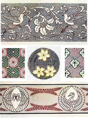
For that sampler, I chose five motifs from Dillmont's book Colbert Embroideries: #14, #2, #5, #12, #15. I arranged them in a similar way as the motifs in the Assisi sampler (in short: maths), so that they would nicely fit on a square of fabric.
Sampler Scheme
But Dillmont's pieces are ... well ... large, to say the least. They are mostly designed for tablecloths and the like. Not exactly the size for a sampler, much less if it is supposed to consist of five motifs. It meant that I had to reduce the patterns in size. I first settled on 50 %, but I miscalculated, and after shrinking the linen, I ended up with 40 %.
Fabric
I had a piece of 32 ct. Zweigart linen left from Party in Provence, where it never got a chance. I was quite pleased to stitch on linen for the first time, all the more as the Murano (Jobelan) fabric wouldn't be particularly suited for this kind of embroidery. Murano is a counted blend, which is good for stitching the counted backgrounds, but for the surface stitches, required for the outlines of the patterns, the spaces between the fabric threads are too wide, i.e. the fabric shows distinct "holes", as even-weave generally does, so that it is hard to place the surface stitches exactly where they are meant to be. I was confronted with this problem in the practice piece before.
On linen again, the counted stitches would be hard to place, they would come out somewhat distorted. I had to make a compromise. My thought was, that placing the damask stitches on linen would be a little easier than achieving smooth outline stitches on Murano. That's why I went for the linen.
I pre-shrinked the linen (see Problems Encountered) exactly according to Mary Corbet's instructions: put it in a bowl with the hottest tap water I could get, let it rest there for about 20 min., changed the water to cold, drained it and poured boiling water fresh from the kettle into the bowl with the linen. This ice-cold-and-boiling-water procedure got repeated, the linen got rinsed one last time in cold water, then rolled up drip-wet in a towel. I ironed it for the first time when still slightly damp, let it dry, and ironed the dry linen once again. Now it was crisp and smooth - in a word: beautiful. And I could see the size coming out of the fabric already in the first bath: the water turned milky and even a bit foamy.
The interesting thing was the extent of shrinkage on the linen from 57 x 52 cm to 54 x 48 cm, that is from 22.5" x 20.5" to 21.25" x 19".
After neatening the edges, I basted some crosshairs in for the alignement of the three middle motifs ... AND ALL THAT FOR NOTHING! Why I ended up stitching the sampler on Murano again, heaven knows. But this is exactly what happened ... 😕 ... so I still don't embroider on linen ...
Transfer
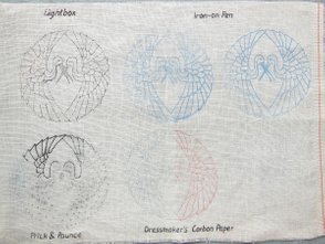
This time, I was bound and determined to transfer the patterns as perfectly as possible. To that end, I underwent a complete test run on pattern transfer, which you can read about here, including lightbox, iron-on pens, dressmaker's carbon paper, Prick & Pounce.
Transfer Test Run
As a result of the test run, I decided to do the transfer with the DEKA iron-on pencil. The pencil has a soft purple lead, which can be sharpened, so it handles just like any good crayon.
Over the course of working on the sampler, every design was transferred separately to avoid fading of the lines before I would get my hands on it. As yet, no transfer worked out perfectly, as you can read about under Problems Encountered.
Colours
I didn't like the original colours in the book. To me, they looked kinda frumpy. I spent a lot of time to change them, finding out what colours and colour combinations I would like. It didn't work. I found it too laborious to colourise all the little crosses and lines, whether with crayons or in a graphic program, and a superficial colouration didn't work. I just didn't get the feeling.
When I got sick of all the unavailing trials and errors, I told myself without further ado, that this will be a sampler for practice only, no need to fuss with the colours, I'll simply apply the colours from the booklet. As far as they were still avaible. Because some were not. I had to find a possibly similar substitute.
Threads
As Thèrése de Dillmont says in her booklet:
Begin by filling in the background with damask stitches done in a comparatively fine thread, such as DMC Pearl cotton (Coton perlé) Nos. 5 and 8. DMC Special stranded cotton (Mouliné spécial) No. 25 or DMC Floss flax or Flourishing thread (Lin floche) No. 16. When the grounding is completed, embroider the outlines and the ornaments in running stitch, flat stitch, plaited stitch or herringbone stitch with a thicker thread, such as DMC Pearl cotton (Coton perlé) No. 3.
At first, I had in view stitching the background with pearl cotton #8 and the outlines with pearl cotton #5.
The trouble was that, after having had to diminish the size of the design to 40 %, it had become too small for those numbers of Pearl cotton. What was I supposed to do? My thread order was already placed ...
My first order took two weeks to arrive, and this was only a partial delivery, because the shop had, as I was told, to wait for one colour of pearl cotton #8 to be shipped by DMC. Yet I enjoyed the DMC pearl cotton, which I got in my hands for the first time. So far I had stitched with Anchor pearl cotton. The DMC stuff seemed to be noticeably slimmer and softer than the Anchor threads.
In the meantime I had come to the conclusion that I would be best using two threads of stranded cotton for the backgrounds and pearl cotton #8 for the outlines. This meant, I had to place a new order, because I don't have a real stash of threads yet. So I had to swallow the pill and order once more stranded cotton and pearl cotton #8 in all the lacking colours. I would rather have bought #12, but in my place, this size is hard to come by in all the available colours.
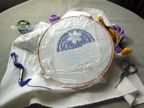
I was fortunate to have two colours of stranded cotton for the background in motif #12 and motif #5 available - the first two motifs in the centre row, which I had transferred and wanted to stitch. While waiting for my second order to arrive, I could at least begin to stitch the halves of these two backgrounds: double crosses in Blue fast dye (motif #12) and tiny horizontal lines in Geranium red (motif #5). Love the names they gave the colours back in those days! Today, there are only numbers ...
Problems Encountered
- How consternated was I when after the first transfer test on a scrap of linen not only the tracing paper, but also the linen turned all yellow!
Solution: I posted this problem right of the bat in our Facebook group, where Mary Corbet herself enlightened me about the necessity to pre-wash linen, because linen is usually treated with size by the manufacturer, and it is the size that turns yellow. What would I do without my facebook friends from Needle'n Thread!
This was the moment, when it occurred to me once again, that linen should better be pre-shrinked before embroidering on it, at least when the embroidered piece is designed to be laundered in the future. Even if you don't plan to launder it, you never know what could possibly happen.
You can read about the pre-shrinking process and its results above under Fabric. As you can see there, all my efforts in preparing the linen were to no avail in the end, because for some mysterious reason, I found myself transferring the design onto Murano again ...
- The transfers didn't come off perfectly, there were some glitches in each pattern. They resulted either in slight smudges, or several lines were nearly invisible, or the lines came out too thick or ... Now, thick lines or even slight smudges aren't necessarily a problem in this kind of embroidery. The background gets almost completely covered by the damask stitches, and even pearl cotton #8 is thick enough to cover most of a bold line. What was worse, were the invisible parts. Since you don't want to iron on the same motif one more time on top of the already existing, there's only one ...
Solution: to re-draw the lines with a pen. But that's a problem rather than a solution. I'll tell you why. Yeah, some folks say, lightbox tracing is THE method for transfer today, and after trying it on good linen, it is my go-to solution, too, BUT! Murano/Jobelan is not linen! Murano/Jobelan is a counted fabric with holes and round threads around the holes and all - Murano/Jobelan is bumpy! There is no way to get a decent straight line on this fabric, if you don't want to use a marker. And the only transfer methods for getting an exactly placed pattern are lightbox tracing and ironing-on (if you set aside the Prick & Pounce method, as I necessity-driven do).
Solution? I don't have any yet. When it comes to counted fabric, I will must needs stick with the iron-on pen. Someday, when my financial situation allows, I will order one of these legendary fine-tipped iron-on pens from Sublime Stitching in the US, 15 Euros shipping or not. Up to that time, there's only trial and error with the DEKA pen left ...
- Masking tape. My years old no-name masking tape, left from my painting adventures, leaves stark residues on fabric. After all you have to fix the tracing paper somehow to the fabric before ironing the pattern on. If the pattern is not very large, I would rather not risk using pins, so as not to damage the soleplate of the iron.
Anyway, after removing the tracing paper of the first motif, there was an ugly, dirty stain from the masking tape left on the fabric. Fortunately enough outside the motiv. Washing the fabric once again with soap didn't help - the stain was still visible! I had to remove it with cleaner's naphtha.
Solution: One more item on my to-buy-list. As I found out googling, TESA Masking tape is said to be residue-free. But so was my masking tape too, only on canvas and paint. I can't do anything but try that out.
Work in Progress
Motif #12
The first motif, which went in the centre of my sampler, is a three-blossomed flower with decoratively curved stems and leaves. The background filling is composed of stars in Blue fast dye (797) and cross stitches in Parma Violet (209). The flower petals are outlined in satin stitch, and the insides of the flowers are done in herringbone stitch, the colours being Saffron Yellow (726) and Parma Violet (209). The swirly stems and leaves, finally, are worked in stem stitch in Beetle Green (3347).
After having already stitched several lines of double crosses, it occurred to me, that with a reduced to 40 % design, I should reduce the size of the stitches as well! The double crosses or stars were supposed to be stitched over 10 and 6 threads resp. 40 % of the size would have resulted in horizontal and vertical stitches reaching over 4 threads each, as well as diagonal stitches reaching over 2.4 threads. Aside from the fact, that any fraction numbers of fabric threads are out of the question in a counted pattern, the simple crosses between the stars would have been reached over 2 threads only, and this would have been nearly invisible. They would have looked like dots, they would have looked just ... well, bad.
In the end, I changed the proportions in this motif. I stitched the stars over 6 and 2 threads respectively, and the crosses over 4 threads.
Starting with the Blue Stars
As mentioned under Threads, I had placed a new order for stranded cotton and pearl cotton #8. That was March 13. The only threads I already had available, were the stranded cotton in Blue Fast Dye (797) for the stars in this motif and in Geranium Red (350) for the horizontal lines in the next motif (5). On March 22, I had completed the stars, and no thread delivery in sight. So I had to transfer and start the second motif already. I finished the little red lines March 30 - and still no sign of my eagerly-awaited threads. On April 1, I dropped a line to the shop, asking how much longer it might take. They state a delivery time of 5-14 days on their website, and I am waiting already a whopping 21 days by now! On April 3, I got the answer that they are still waiting for one pearl cotton from DMC, which should arrive this week. Fine. On April 10, 4 weeks had passed since placing my order, and still no delivery notification! My attempt to call them on the phone was of no avail – it was Wednesday, and on Wednesdays the shop is open till noon only. By the time, I was really cross! Next day, I got them on the phone. The lady told me that they were still waiting for the pearl cotton in question, but she proposed immediately a partial delivery at no additional charge. Why couldn’t they do that in the first place, two weeks ago? The package arrived April 15, which means that I had to wait nearly 5 weeks for a bunch of threads! And one thread was still lacking ...
I don’t know who’s to blame for such delays, DMC or Stickteufelchen. But I’m seriously asking myself how I would be able to carry on a webshop (which I plan to do someday) when I have to wait ages for the simplest supplies? There’s no needlework shop around for at least 100 km, I just have to rely on online shops.
But after all, I was able to take up my hoop again and continue stitching the first motif: little crosses with stranded cotton and the flowers with pearl cotton in surface stitches …
Continuing with the Violet Crosses
Now to the vocabulary of the surface stitches in Dillmont’s booklet. It is a translation from French, and it is, as already mentioned elsewhere on this website, in some places a misleading translation, at least related to the stitch names we use today – in other words, misleading for me. Stem stitch is called running stitch, satin stitch is called flat stitch, but upon closer examination (which is a strain for the eyes), it is a stem stitch, and it is a satin stitch. In the first two motifs, I was using outline stitch for stem stitch, but then I realised that it should be stem stitch indeed (they are both very similar, save that stem stitch is done by keeping the working thread below the line, and outline stitch by keeping it above – which is why the first results in a much more significant rope-like look).
That’s why I wasn’t sure at all, whether the indicated herringbone stitch for the pistils and the little petals inside the flowers were really meant to be herringbone stitch. I couldn’t imagine working such a dense herringbone as shown in the photos in the book, without visible spaces between the threads. Maybe rather fishbone stitch? herringbone, fishbone ... could it be the next mistranslation? But no. I spent a whole hour poring over the booklet and pics in the internet, until I was convinced that this translation, at least, was done correctly. And it is possible, indeed, to work the herringbone stitch so densely!
Outlining the Petals in Split Stitch
The satin stitch gave me a hard time, mainly due to the alignment of the petals. I outlined the petals with stranded cotton in split stitch first, in order to give the satin stitch a better support on the edges. Someone asked me how it is possible to work surface stitches on even-weave? Well, it is possible, you just have to split the fabric threads, where the holes don’t meet the line. Other than Aida, Murano (Jobelan) is a pretty soft fabric. Not the fabric was the issue, but the necessity to permanently change the direction of the satin stitches, because the petals are arranged in a circle.
On May 14, the first motif was finished and done! After more than two months! But this was mainly due to me having to wait for weeks on end (six weeks in total!) for the threads. In the end, however, I liked what I saw.
First Motif Finished
Motif #5
I had to re-draw the lines of the second motif with ink, because the iron-on transfer wasn't visible in some places. After my experiences with transfers so far, I still don't know how to solve this problem. The DEKA iron-on pencil proved a failure in my case, despite a few quite successful test runs. Either the lines come out smudged ... or the centre of the motif is clearly visible, yet fading to invisibility towards the edges ... or the transparent paper blisters ... you never can rely on the outcome! Maybe the Sublime Stitching fine tip iron-on pen, praised so strongly by Mary Corbet, would in fact be the best solution. The point is, that I don't have enough money for the time being to pay $ 15 shipping, when the pen itself is a miserly $ 6.75, much less do I have the money to buy more than one pen.
Someone on facebook wrote, forget all other methods, today we all use lightboxes. I agree that tracing on a lightbox is a great and absolutely reliable method - provided the fabric is suitable for tracing. All relatively smooth fabrics, such as smooth linens or calico, are, but Jobelan and other coarser weaved fabrics cause the pen or pencil to jolt across the threads, resulting in wobbly lines. Carbon paper again doesn't qualify for a transfer where the design has to be placed exactly at a certain spot, as is the case with this sampler.
In this case, the ink lines came out somewhat distorted or even misplaced, but overall it was ok. The background would be covered entirely, and pearl cotton #8 is still thick enough to cover minor mistakes in the outlines.
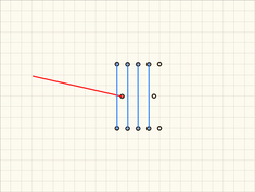
The background had to be done in alternating rows of faggots in Scabious Violet (396), filled with tiny vertical lines in Geranium Red (350). Oh, the faggots! They give you a hard time to execute, because they are made of 9 vertical stitches, held together by one horizontal stitch thrown over 6 threads, which I had to reduce to 5 vertical stitches, held together by a stitch thrown over 3 threads. Now, the horizontal stitch, since it is supposed to hold the vertical stitches together, needs to be worked last. But since it stretches over 3 threads only, you have to fiddle about with your needle on the back of the fabric in order to meet the right hole, which is already covered by the vertical threads, after all. And then, while bringing your needle back to the surface, you will inevitably split these vertical threads, and you have to manoeuvre your needle below a whole bunch of double threads in order to come out on the outside of the cluster.
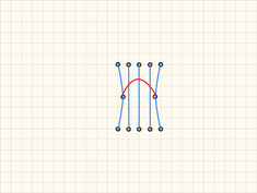
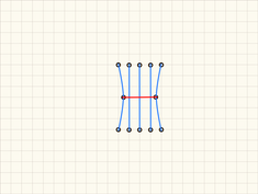
But never fear! Here's what I came up with to help us out:
You will need two tapestry needles (or one tapestry - with a blunt tip - and one embroidery needle - with a sharp tip, when you have to split the fabric thread with the horizontal stitch as in my case) threaded with two threads each.
- Pull the first double thread through the first spot for the holding stitch (let's call it bartack), then park it somewhere in the fabric, where it doesn't interfere with your stitching.
- Grab your second needle and, beginning from the side of this first bartack stitch, work several bundle stitches up to the spot, where the bartack is supposed to be anchored, but not covering it (in this case 4 stitches).
- Bring the thread for the bartack down through the second spot and up where bartack for the next faggot is supposed to start.
- Now pull the finished bartack a little ways out to form a loop large enough to bring needle and thread through.
- Next work the remaining bundle stitches, carrying them through the little loop before bringing the needle up where the next bundle is supposed to start.
- As soon as the whole bundle is done, pull the bartack tight.
Here's a diagram for illustration. I think you get the idea:
With this method, you just have to pay attention, so as not to tangle the two double threads or split them on the backside.
One thing that amazes me every single time I'm working on a new project is that from the start it seems to me as if not much will come of it, but as soon as it is half-done, something changes and suddenly it looks admirable. Same in this case. After half of the background I had found my rhythm, and all the blue faggots together with the red dots just looked good to me.
On May 30, I had come to stitch the outlines. The twigs were done in outline stitch, after which I proceeded to the grape leaves. "Plaited stitch"! Great! First I thought that it is meant to be plaited braid stitch, but then I found this video on Needle'n Thread showing how to do the basket stitch (also called plait stitch, e.g. in Thomas's dictionary), which looks exactly like the one in the booklet. Unfortunately, this stitch doesn't take sharp curves well, and these grape leaves all have sharp tips, not to mention two tiny notches in the top leaves. It took me several days of experimenting and research, until I found the solution in high resolution: zooming in the pics in the booklet until there was hardly anything to recognize, I saw how they apparently did it. I will show it to you in my stitchionary as soon as I get to the basket stitch.
Basket Stitch, Outline Stitch & French Knots
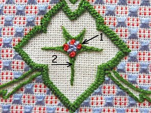
The veins in the leaves were done in outline stitch again, the first of which came out crooked and screwed up. Why? The second vein I did showed me why: because I had shortened my stitches in the curves (1), as normally you are supposed to do, but in this case it did only cram the stitches. Also, they looked better by first working the short branch in the spots where the veins are branching out in the middle (2), and only then covering its connection point by a nicely curved long branch.
Finally: the French Knots in the centres of the leaves in Geranium Red (350) and Scabious Violet (396). This was a delight, tempered only by the notion that this second motif was now finished, and I was forced to grapple with a new transfer again ...
First Two Motifs Finished
Motif #2
This time, I used the Prym iron-on pen for the transfer. It has a waxy pink lead. Maybe on this account I didn't much like drawing with it (I don't like drawing with wax crayons either). The ironing process went quite well, except that several spots remained white. But they were just short line segments, so they didn't bother me.
The background filling is composed of double cross stitches in Beetle Green (3346), thrown over 6 threads, connected by horizontal und vertical straight stitches in Indigo Blue (823) over 3 and 6 threads resp. In order to stick to the relation 6 : 3, I couldn't reduce the size of the background elements to 40 %. The straight stitches would have been thrown over 1 and 2 threads resp. in this case, so they would be barely visible. I decided on a relation of 4:2. That is why this design's background came out a whole lot more open than the the others.
After the faggots in the previous motif, this background was pure joy to stitch. It took me a mere 3 days to complete it!
Quick Background
All the outlines were to be done in stem stitch in Turkey Red (321), whereas the petals were to be filled in fishbone stitch with "simple knot stitches", that is French knots - both in Snow White. Just as I couldn't imagine to fill the petals and pistils in motif #12 with herringbone stitch, that's what I felt here about the fishbone stitch, not to mention the fact that fishbone stitch still figures on my "blacklist" of stitches. All the more was I pleased by the outcome. It did cost me a good deal of struggle, frogging included, but somewhere along the line I catched on to how to proceed best, and from that point on it was ok.
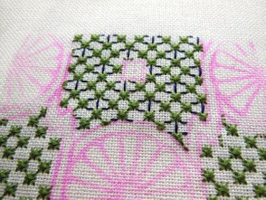
Interestingly enough, I met with similar difficulties in the stem stitch, namely in the spots where the petals meet the outline. See the little triangles in the photo above, formed by two separating petal lines and the first outer circle? At the first onset, I treated the lines running from the centre to the outline as spokes. The whole thing looked to me like a wheel, hence the spokes. That is to say, I was working every single spoke as one stem stitch line from the centre outwards - and consequently got a big problem with these tiny triangles.
It took me quite a while to realise that these are rather petals than spokes, so I should treat the lines as petal outlines. You might say, it sounds like nitpicking, for what difference does it make? Well, it does make a difference. As long as I was seeing a wheel with spokes, they were single lines running from the centre outwards, where they were branching off in two directions. But as petals, there were no single lines, but rounded outlines of a whole petal, which were just touching the outer circle. For lack of a better explanation, here's a raw diagram:
Branching out Spokes vs. Petals
Do you see what I mean? The petal concept made the stitching much easier, for now I started the line in the centre as before, but I didn't end it at the outer circle, just kept stitching it around a curve, stopping at the touch point whith the next petal. It's a similar concept as with the leaf veins in motif #5: the next petal outline was worked from the centre again onwards over the end of the first outline, hereby covering it. And voilà - all was going easier and looking much better!
It was then, when I was delighted by the beautiful contrast of the Turkey Red and the Snow White, as well as by the sheen of the pearl cotton, both trying to outshine each other.
Third Design Finished
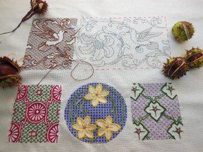
After another 2 months, the third motif was accomplished. The first motif had taken me 2 months, the second 1, and the preparations 1 month. It was August 13, when I unclamped the sampler, and with a sense of foreboding traced the fourth motif with the iron-on pencil on tracing paper ...
Motif #14
Unsurprisingly my foreboding didn't deceive me. This one was a large pattern, but the tracing paper was resting flat on the fabric, I didn't have to pin it down. So I put the iron straight down onto the design and held it for 15 secs, whereupon I lifted it straight up and moved to the next section, making sure not to shove it back and forth. Yep. How could it be otherwise: the only part of the design that was clearly visible was the centre - the sides and particularly the edges came out faint to not visible at all. 🥳
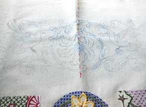
What was I supposed to do? I had to trace the whole pattern directly on the fabric once again using a sepia multiliner. The result was still far from perfect. Despite sticking the fabric to the table with crepe tape, it kept moving and distorting bit by bit ... because ... why, because it's just fabric, I guess ... But it was much better than before, anyway.
Double Transfer: Iron-on Pencil + Ink 😠
Oh no, faggots again! What a clever design choice - with unfailing intuition, I chose the two of all designs that include faggots covering the background. 😕 You can read of faggots and my method of dealing with them HERE.
This time, the colour choice wasn't to my liking either. I know, I was saying this at the beginning of every motif, though later it turned out that they look pretty. But this Baby Blue (334 - the instruction calls it Indigo, but this isn't indigo for sure! - maybe DMC changed the colour number?) - Mandarine Yellow (740 - for my eyes, it's rather a bright orange) - Cachou Brown (433) combination is really ugly. Ok, the nearly finished design, when looked at from afar, appears to be all brown, and doesn't look that bad, but even so - not really my cup of tea colourwise.
The next obstacle came up on September 21, when I finished the first third of the motif. Even the ink lines had faded to a large extent now! It was impossible to continue stitching that way. I had no option but to trace them all over again. This time I settled for black ink. But instead of my usual Copic Multiliner 0.3, I picked up a Staedtler Pigment Liner 0.3 ... and was highly surprised how smooth the tracing went! The metal tip of the pigment liner is distinctly thicker than the tip of the Multiliner, and it conveys a sense of softness while tracing, even on this bumpy fabric. I was so satisfied with the outcome that I decided to scrap the whole idea of iron-on transfers, when I could just as well trace my patterns with a pigment liner on the frosted glass surface of my folding table with the (grotesquely contorted) magnifier lamp underneath.
Freshly Re-traced Pattern
Halfway through, I noticed much to my chagrin that the blue floss was running out. I had consciously ordered two skeins, regarding the size of the motif, but now I saw that I needed even more.
SIGH ...
In the course of this year, I had placed 3 orders in total - and every order had been accompanied by annoying difficulties. Something had always gone awry, be it the fault of the shop or the fault of the parcel service. Could I expect something else of the fourth? Of course not.
I placed the order September 29. The very next day I was noticed of the dispatch. Wow! But wait! The next day my tracking list claimed, that the parcel is on its way back to the shipper, because they were "unable to locate the recipient". The address in the tracking was lacking the street address. It could be the fault of the parcel service or of the online shop, who knows.
On October 7, when the parcel was said to be delivered back to the shop, I finally got the owner on the phone. She said, no prob, we'll ship it right back to you. I waited another five days - no parcel. On Saturday and on Monday both, I tried to get somebody on the phone again, but although I was calling during their normal trading hours, I was listening to a recorded message only, a voice so faint that I was unable to understand a thing. So I sent them an e-mail.
October 15 I got a reply from the owner, that she had to unexpectedly go to the hospital for several days, that's why she would ship the parcel only today. Of course, I sympathised and was sorry for her, just asked myself, if she alone runs the business - a pretty large brick and mortar shop together with an online shop? Anyway, there was still no parcel through the next six days. Again I tried to catch her on the phone on Monday 21, and again either nobody picked up or I got a busy signal. Again I wrote an e-mail. Next day, October 22, I got a shipping information with tracking number from her, without a further comment or, God forbid, an apology. But now I could at least track down, that she had handed out the parcel to the parcel service at 11:30 am this day. Next day, the delivery failed, because at 8:59 am no one was at home, so it is waiting now in some DHL station for collection. But only from today 7 pm on ...
Waiting for Thread Supplies
This was the state of the fourth design, when I came to a halt and had to wait for the floss. Meanwhile, I was stitching the fifth design alredy. When the first third of the fifth motif was done, and the hoop had to be shifted, I could finally go back to #4 and finish it. This was November 12, and I finished it November 28. And here it is:
Four Motifs Finished
Motif #15
This time the transfer ran like a charm with the black Pigment Liner. Save that I had traced the design onto the backside of the sampler ... which I noticed not until all the work was done ... (I'm gonna spare you my literal reaction to the discovery.🤬) Mercifully, the lines were clearly visible through the fabric, so I was able to trace it again onto the right side.
Crane Design
Oh my - this design is my absolute favourite out of the five! It is so delicate, and for the first time I love the colours and their combination from the beginning. The principal background consists of little slanting stitches in Wood Grey (614), while the background of the bird medallion is made out of oblong crosses in Cream Yellow (712). This last one is glittering in the light like some mysterious silver - it is beautiful. The outlines of the birds and the borders are done in Ash Grey (413) - the first in stem stitch, the latter in herringbone stitch. The decorative branches at last are worked again in herringbone stitch for the leaves and stem stitch for the branch itself, both in Locust Bean Brown (355). This colour combination really has a ring to it, aside from the fact that I love the elegant stylisation of the cranes.
For some mysterious reason, I have a hard time every time I want to start a herringbone stitch. Here, too, I had to peek and count and think and even do a sketch in the end to suss out where to locate the first two stitches. Similar thing with the oblong crosses in the medallion. After the first stitches are placed, I get the hang of it immediately, and all is going nicely.
I finished this last motif January 27. During December and the first two weeks of January, I was hardly able to stitch, because of a sudden onrush of annoying errands, mingled with my daily translation job and the inevitable pre-Christmassy stress.
Last Motif Finished
And here it is - after almost one full year: The Colbert Embroidery Sampler!
My Colbert Embroidery Sampler
It was a stiff - a very stiff! - piece of work. The most labour-intensive part were the backgrounds. To think that the original designs were a good deal larger, meant to be made into tablecloths and the like! This sampler alone took me a full year, though, admittedly, I was stitching it alongside a couple of other projects, including long weeks of waiting for thread supplies.
But it was a beloved piece of work, too. I love the combination of counted and surface stitches and the effect the voided patterns give. Not least was I happy of having discovered a nearly forgotten embroidery style and of having been given the opportunity to bring it to other people's attention.

